By Alex Murton | Read time: 6mins
Hello!
I hope you’re having a good week so far.
It’s a bit of a late email today but you know what they say–better late than never!
It’s a simultaneously happy and busy time here at the studio. We’re working with loads of great clients on everything from website redesigns and builds to audits and general ecom support.
In the 9 years that Studio Almond has been operating, we’ve been lucky to work with a mix of lifestyle clients from all sorts of industries. While their challenges, strategies and audiences vary, there are some common mistakes I see people make over and over again that I’d like to help you avoid.
Here’s what I’ve got for you today:
Concept
🌱 5 common growth strategies that rarely deliver
Resources
🤓 Material I’ve enjoyed lately
Tech of the week
🚧 Canny
Studio News
📰 A fresh drop of launches
🌱 CONCEPT
5 common growth strategies that rarely deliver
I don’t have to tell you all how exciting it is to work in a fast-paced environment with ambitious growth targets. But on the flipside, that kind of environment can be a petri dish for poorly thought-out strategies.
When the pressure is on to deliver results, it’s amazing how often the same ideas come to the surface. I’ve seen countless brands try to implement the same quick-win growth tactics for little or no impact.
Today, I want to help you avoid making the same mistakes. Here are 5 strategies to avoid.
Removing friction in the user journey without considering the audience
A streamlined path to purchase might sound like an improvement, but simplification isn’t always the answer. It entirely depends on your audience and their purchase behaviour. While some products are self-explanatory, others need to bring potential buyers on a journey. This is particularly true for luxury items and healthy and beauty products. High-intent customers often need more details, not less, to make informed decisions.Obsessing over button colours
Colour testing has its place, but there’s no magic hue that will transform your metrics. Pick colours that align with your brand, ensure it’s legible and accessible, then move on.Adding 1 more email to your welcome or post-purchase flow
A single additional email is unlikely to make a big difference. Effective communication strategies are multi-channel and integrated, not a collection of standalone messages. Focus on the ecosystem as a whole.Relying on third-party auth options for sign-ups
Offering quick account sign-ups via Google or Facebook may increase sign-ups, but it often attracts low-intent users who don’t stick around. I’m not saying these options aren’t worthwhile but you need to have a solid multi-channel nurture campaign in place to turn these flippant sign-ups into viable customers (see point 3).Hanging all your hopes on a home page redesign
Don’t get me wrong, your home page is important. It should communicate who you are, what you offer and why visitors should care. It should also encourage users to explore the rest of your site. That’s why focusing on a home page redesign alone isn’t the solution. You have to consider how it behaves with the rest of your site (like your PDP), mapping out the user journey from beginning to end.
The takeaway
Quick fixes often fail to drive meaningful growth. Real results come from bespoke strategies that align with your brand’s unique goals and customer journey. There’s no one-size-fits-all solution in ecommerce.
🤓 RESOURCES
Material I’ve enjoyed lately
📗 Read
Key Person of Influence by Daniel Priestly
With AI becoming increasingly dominant, building a personal brand is more important than ever. (You can revisit the newsletter about this here). This international bestseller provides an overview of how to become more visible, valuable and connected through a step-by-step strategy. It’s well worth a read.
While I read the book for the first time last year, it was published around 7 years ago and gets more and more relevant every day—a must read for any business owner.
📺 Watch
The ultimate guide to product building with the man who changed software
Greg Isenburg just interviewed Jason Fried, the Co-founder and CEO of 37signals. They do a deep dive on innovative startup ideas, the current software landscape and frameworks to building products people love. I haven’t watched it yet but I’m excited to get into it.
🎧 Listen
Deployed by Studio Almond
Maybe it’s the glimmer of summer in the distance but lately, I’ve been loving a party playlist. The team collectively created this one for a little get-together we had to celebrate the opening of our current office and it’s got some great tunes in it. Best enjoyed with a drink in hand (alcohol optional).
🚧 TECH OF THE WEEK
Canny
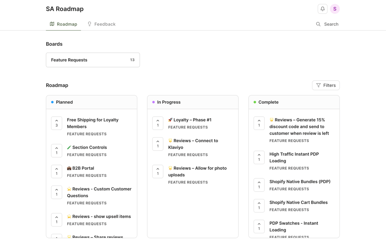
The Roadmap members among you will be familiar with this one but I wanted to mention this because it has been a great project management tool.
We’re using it to show new Roadmap features in the pipeline while giving members the opportunity to request new ones and vote on other submissions. It’s minimal, simplistic and effective, allowing users to get a transparent overview of our progress while actively feeding into it.

Canny could be used for any number of projects that require input from external parties. Check it out if you’ve got a project to manage with a number of stakeholders.
📰 STUDIO NEWS
A fresh drop of launches
As I mentioned, we’ve been busy here at the studio working on some great projects. The next couple of months have some exciting launches coming up—here are some to keep an eye out for.
Abel
Through a website redesign and build, we’ve taken on the challenge of communicating scent online and in turn driving sales. With a more intuitive and flexible admin experience, we can’t wait to see Abel scale internationally.

Leif
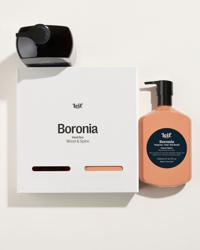
It’s not often you get to work with clients with this much internal design talent. Packaging designers first, creators of hand, body and hair formulations second, we’ve been lucky to work with Leif’s incredible team and their excellent content on this website redesign and build.

MOSAIK
We’ve been learning a lot about the world of dermatology throughout this project with MOSAIK. With a new guided selling quiz and phase 1 of the website redesign and build underway, soon they’ll have the tools to educate customers on their clinically-formulated skincare for all spectrums of skin.

Roadmap
That’s right, Roadmap is about to get its own website! As well as promoting the features, we’re creating a campaign builder tool and a hub of strategy content. Stay tuned.
That’s all from me this week.
Thanks for reading!
Until next time.


Alex Murton
Managing Director & Co-Founder
Studio Almond

